Branding and web · 2020
RocketSeventeen
Identity for an open-format DJ who lives for the energy of the most intense nights.
- Client
- RocketSeventeen
- Year
- 2020
- Services
- Branding and web
- Duration
- 2 weeks
The challenge
RocketSeventeen wanted a design that captured the essence of nightlife and the EDM world.
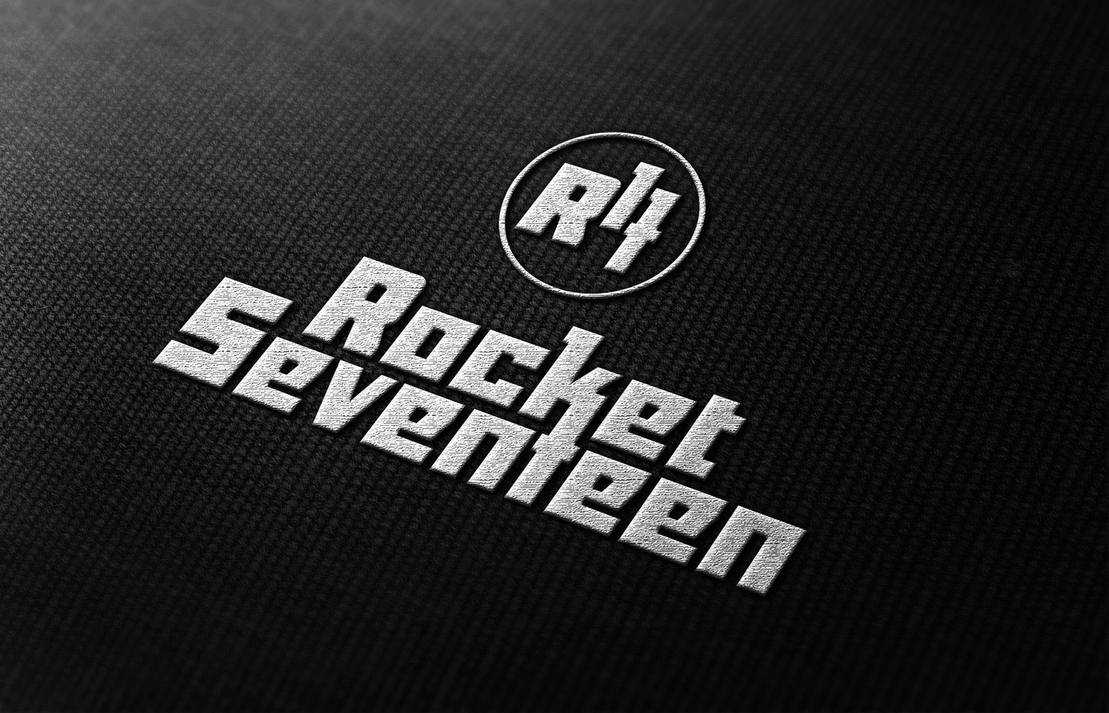
The R17 seal
The logo includes a circle that can be used on its own as a seal, ideal for CDJ screens, projections or any other medium. Inside, the initials «R17» make it recognisable and versatile.
A hidden 17
It all started with custom lettering. In the logo, the «K» and the «T» merge to form a «17», creating a sinuous link between the seal and the full name. That way the brand is recognisable in both its full and short versions, from merchandise to live sets.
The result
A distinctive symbol that conveys the energy of his sets and lets him connect with his audience in an authentic way.
Play with it
A seal that leaves its mark
The R17 circle works on its own: on a CDJ screen, on a flyer or as a stamp on paper.

Spin the coin and tap the paper to stamp
One brand, many forms
Explore the versions of the identity.
Full logo. The full version, with the K and the T merged into a «17» that links the name to the seal.
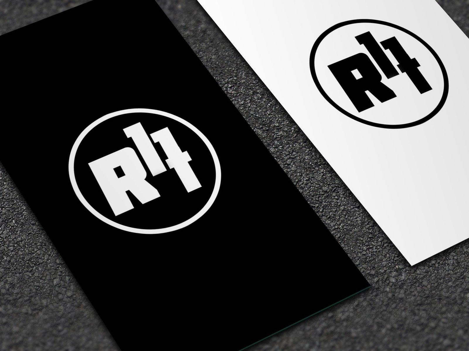
R17 seal. The circle works on its own: designed for CDJ screens, projections, stationery or merchandise.
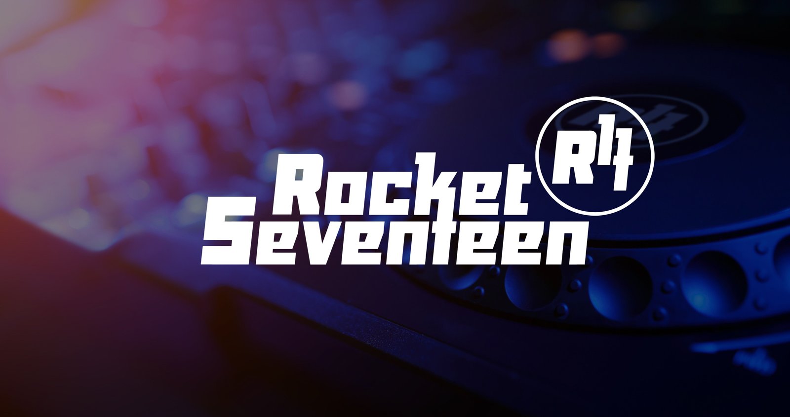
In context. The brand on its home turf: the DJ booth and the night.
Shall we bring your project to life?
Tell me about it