Branding and web · 2025
Auréis Psicología
An identity that reminds us that every person already has gold inside.
- Client
- Auréis Psychology Centre
- Year
- 2025
- Services
- Branding and web
- Duration
- 4 weeks
The centre
Auréis is a psychology centre dedicated to providing emotional support and guidance to people who want to grow, heal and thrive in an atmosphere of understanding and respect.
The brief
The logo was born in close collaboration with its founders, Blanca and Ariadna, two exceptional people who shared their vision with me: a centre where people feel safe and supported.
The idea
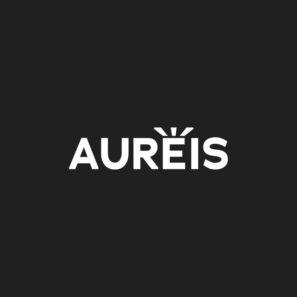
We focused on the word itself, «Auréis». The accent on the «E» becomes three strokes that express shine and light. It symbolises that every person already has gold inside, and that the centre is there to help reveal it.
Typography
The typeface brings elegance and trust, two essential qualities for a psychology centre where safety and calm are everything. The goal was a warm, professional atmosphere in which people feel comfortable throughout their process.
The result
A logo that represents Auréis’ identity and is designed to work in any format and on any surface. Its blend of elegance, trust and shine helps the centre be recognised for what it is: a place of refuge and care, where people find the support they need to shine.
Play with it
The gold within
The brand’s idea in a single gesture: inside every person there is something that shines.

Press and hold to reveal the gold
Construction
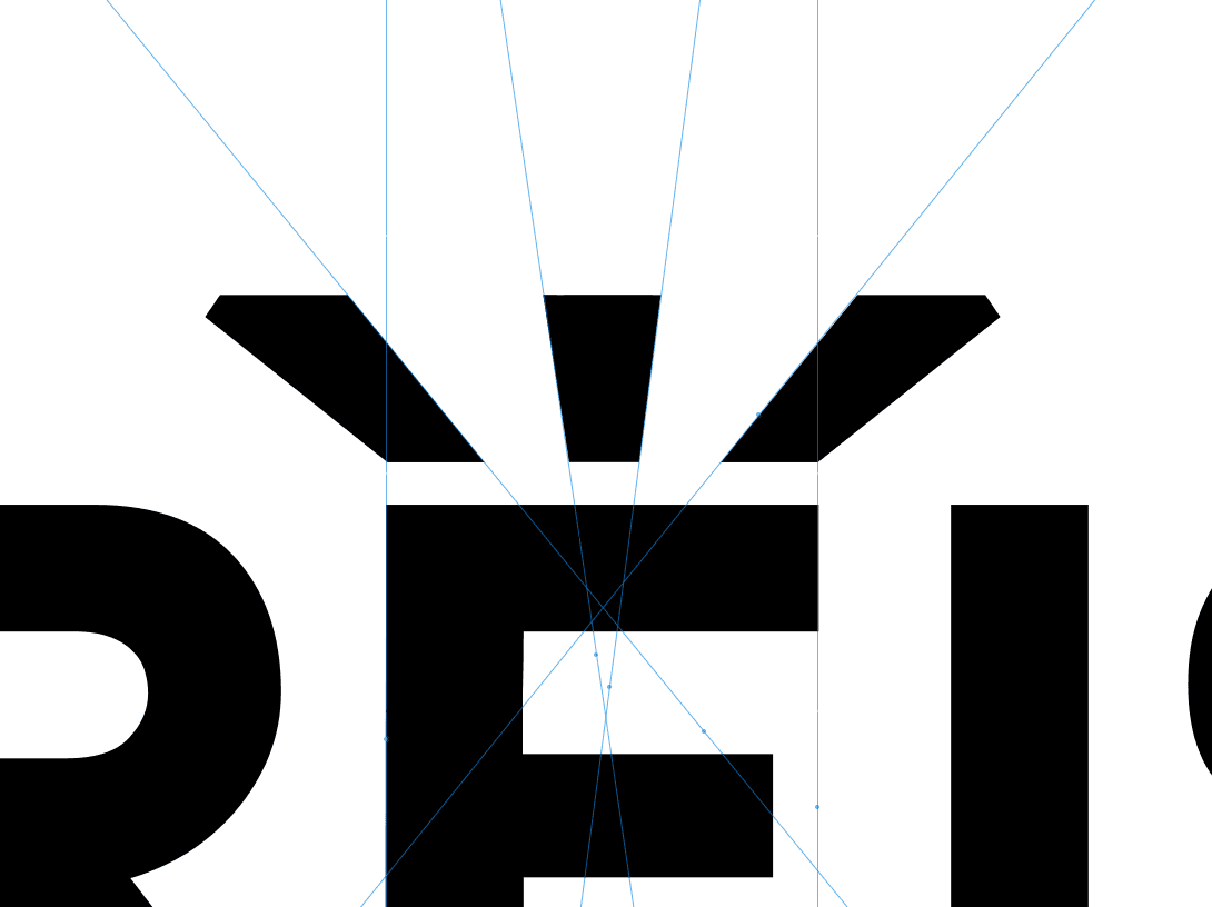
The shine is born from the letter
The accent’s three sparkles are drawn on a grid of lines that converge on the «E».
Shall we bring your project to life?
Tell me about it